:: FOCUS ::
“Imagine
a world where every document uses the same font, line spacing, and
margins, and you can't judge a book by its cover because all the covers
look alike. It would be a world without document design. And, frankly,
it wouldn't be pretty” (Palmquist 1).
For
educators fighting the idea of visual rhetoric; for first-year writing
students; for graduate students in any field; for Juan, Jane, and Joe
at home or at the office, Palmquist acquaints us all with concepts we
may not have considered before, and he covers those concepts in an
easy-to-understand and easy-to-apply format. Thus, he raises the bar on
how our documents look, and more importantly how they read.
Bedford/St. Martin's 2005 book (booklet-- it's only 133 pages) by Mike Palmquist demonstrates how to see what design is, and how to apply that ne w-found
knowledge. Palmquist gives readers step-by-step instructions on
applying design principles in general terms, and he also focuses on
specifics geared to Microsoft Word, and while not everyone uses Word,
it is still the most common word processing software. Furthermore, he
gives us a “Design Activity” at the end of each section, so we may practice
these concepts. This up-to-date and easy-to-use booklet offers new
insight to the most accomplished Word users, and gives detailed
instruction to those new to the software; the advanced user is never
bored, and the novice user is never confused.
w-found
knowledge. Palmquist gives readers step-by-step instructions on
applying design principles in general terms, and he also focuses on
specifics geared to Microsoft Word, and while not everyone uses Word,
it is still the most common word processing software. Furthermore, he
gives us a “Design Activity” at the end of each section, so we may practice
these concepts. This up-to-date and easy-to-use booklet offers new
insight to the most accomplished Word users, and gives detailed
instruction to those new to the software; the advanced user is never
bored, and the novice user is never confused.
Palmquist
provides this information from both a pedagogical and a theoretical
standpoint, offering readers solid reasons for making design choices,
based on theories of pedagogy and rhetoric. Addressing the canon of
delivery, Palmquist urges us to consider the “voice, tone, and style of
a document…[and t]he growing importance of this visual aspect of
rhetoric” (iii).
:: THEORY/PEDAGOGY ::
Palmquist
introduces readers to the intersection of design, composition, and
theory, and he does so in a brief 133 pages. Beginning in his
preface, moving through his introduction, and sprinkled throughout the
entire booklet, Palmquist establishes and reinforces the fact that
visual rhetoric is rhetoric .
As
Palmquist drives his audience down the boulevard of design, he divides
this text into three main sections: 1) Designing for Effect, 2)
Understanding Design Elements, and 3) Designing Documents. Part I:
Designing for Effect covers understanding design principles, purpose,
audience, medium and genre, and citing sources. Part II: Understanding
Design Elements focuses on fonts, line spacing, alignment, layout,
navigation, color, borders, rules, and illustrations. Part III:
Designing the Documents discusses the various documents we
create--essays, articles, brochures, flyers, multimedia, and web sites.
To
better understand the many topics within this text, I will provide a
roadmap through Palmquist's stellar organizational tools; then, in the
section labeled “Content,” I look extensively at Chapters 1-5, and
finally I will elaborate on some of the “design activities,” which
Palmquist weaves into the end of each chapter--reinforcing that
chapter's central concepts. This excursion will provide a thorough lens
into the book's design and approach, through one of its major units,
and through some of its individual topics.
Included
in this uber-reliable resource is an extensive list of outside sources
to help readers further explore new concepts. Several of these sources
are set as links throughout this review, providing immediate
investigation of that concept.
:: ORGANIZATION/LAYOUT ::
Organizational tools abound in this little book. Palmquist conveniently
gives the reader side-bar how-to's in a concise listing on the inside
front cover. These sidebars (designed in pale orange with contrasting
burnt-red headers for both emphasis and clarity), are step-by-step
instructions for creating charts (see page 79), formatting tables,
making the most of text boxes, planning color choices (see page 68) ,
working in columns, picking fonts, setting margins, using vertical and
horizontal rules, and even inserting animations (see page 81), audio,
and video into our documents. Then, the detailed table-of-contents
follows a looking, understanding, and doing outline as Palmquist takes readers on a scenic roadtrip through the design principles, the purpose  of design, designing for audience,
mediums for delivery, the elements of design, which paves the way for a
detailed 50-page discussion on effective design. And while the table of
contents is a concrete guide through this text, its most incredible
supplement is its index. This thorough cross-reference provides a
listing of everything from academic essays, to audience, Chicago Manual
of Style, design checklists, marginal glosses, Microsoft Word, MLA,
navigation, persuasion, pull quotes, screen resolution, white space,
and writers as designers, just to name a few items from the seven pages
of alphabetized entries.
of design, designing for audience,
mediums for delivery, the elements of design, which paves the way for a
detailed 50-page discussion on effective design. And while the table of
contents is a concrete guide through this text, its most incredible
supplement is its index. This thorough cross-reference provides a
listing of everything from academic essays, to audience, Chicago Manual
of Style, design checklists, marginal glosses, Microsoft Word, MLA,
navigation, persuasion, pull quotes, screen resolution, white space,
and writers as designers, just to name a few items from the seven pages
of alphabetized entries.
A
fourth organizational tool provided in this book is “Figures by Genre”
which cross-references all of the book's illustrations and graphics.
These are grouped by academic essay, articles, web documents, flyers,
brochures, multimedia, and diagrams. Between all four of these
organizational tools, a reader should be able to find what they are
looking for in record time (for a detailed discussion of Genre, see
Chapter 4).
:: CONTENT ::
Chapter 1 Understanding Design Principles
Some
of the main concepts writers need to grasp in order to design effective
and persuasive documents are balance, emphasis, placement, repetition,
and consistency; Palmquist labels these the “design principles.” Balance is synonymous with alignment--the vertical and horizontal  alignments within the piece. Emphasis is the placement and the formatting of the elements (heads, subheads, graphics) so they grab the reader's attention. Placement is the physical location of the elements, and consistency
is the act of repeating aspects throughout the project such as using
comparable formatting on those heads, subheads, and graphics.
Discussion in Chapter 1 covers these concepts, yet also carries a
reminder that sometimes it's important that documents do not achieve a balance; some projects scream make me asymmetrical! So,
while essays and legal notices need symmetries, movie posters and
magazine ads usually do not. It is vital that writers are able to
recognize when to use which principle.
alignments within the piece. Emphasis is the placement and the formatting of the elements (heads, subheads, graphics) so they grab the reader's attention. Placement is the physical location of the elements, and consistency
is the act of repeating aspects throughout the project such as using
comparable formatting on those heads, subheads, and graphics.
Discussion in Chapter 1 covers these concepts, yet also carries a
reminder that sometimes it's important that documents do not achieve a balance; some projects scream make me asymmetrical! So,
while essays and legal notices need symmetries, movie posters and
magazine ads usually do not. It is vital that writers are able to
recognize when to use which principle.
Chapter 2 Designing for a Purpose
Establishing
the tone of a document “frames ideas and information in a manner that
helps [readers understand] your purposes” (14). So, when writers set a
tone, that tone carries the emotional context for the reader, which
leads the reader to given points in our writings. From setting pull quotes to using a marginal gloss to adding contrast
with the use of color, Palmquist steers writers through the techniques
which convince our readers to accept our ideas. “Sometimes a picture
really is worth a thousand words” (18) and Palmquist discusses how
diagrams and other graphics help writers to position our ideas inside
our readers' minds.
Chapter 3 Designing for Your Readers
While Aristotle's Canon of Delivery addresses the importance of audience, many beginning writers today do not consider who that audience is and how to reach them. Designing Writing's Chapter 3 offers a deep discussion on document organization and how  organization helps readers understand content. In this way Chapter 3 covers how different parts of a document function differently; how they do different work. Interestingly,
here Palmquist also covers the ways in which tables of contents and
navigation bars are alike, and how each work to steer the audience down
a given lane of information. So, whether reading a website's buttons or
an essay's subheads, the visual cues propel our audience down a precise
pathway--the pathway of our words.
organization helps readers understand content. In this way Chapter 3 covers how different parts of a document function differently; how they do different work. Interestingly,
here Palmquist also covers the ways in which tables of contents and
navigation bars are alike, and how each work to steer the audience down
a given lane of information. So, whether reading a website's buttons or
an essay's subheads, the visual cues propel our audience down a precise
pathway--the pathway of our words.
Chapter 4 Designing for Medium and Genre
Often when teachers think of genre
in writing classrooms we think of the essay. But, rarely will students
graduate and go out into the world to write essays. Rather, they will
produce resumes and reports, design flyers and brochures, write emails
and make PowerPoint presentations; Palmquist enlightens readers to the
conventions of these (and several other) genres. Writers must consider
use of color (expensive in printing, free on the web), appropriateness
of type choices
(what tone do they convey?), and page size vs. screen size.
“Understanding the design choices typically associated with a
particular genre, as a result, involves understanding the reasons
behind those decisions” (25), and Designing Writing conveys its messages clearly, thus helping writers understand the reasoning.
Chapter 5 Designing with Your Sources in Mind
Chapter
5 tackles the nowadays controversial copyright issue, and reminds
readers (students yes, and teachers too) that “[i]n most cases,
plagiarism is unintentional” (28). A brief overview of the fair use provision
follows, with substantial discussion directed at avoiding any mishap
with these illegal and/or unethical issues. Palmquist quickly yet
concisely covers these principally important topics.
Chapters 6-17 Design Activities & Checklists
Chapters
6 through 17 share the rich detail and thorough discussions of chapters
1-5, making this tiny text mammoth in scope. Another characteristic
many chapters share is a “Design Activity.” At the end of these
chapters, with the looking done, students proceed to the doing
by working through quick yet rich tasks, tasks which reinforce that
chapter's concepts. For instance, at the end of Chapter 5, readers are
asked to look at three documents which use outside sources. Readers
examine how those documents acknowledge their sources, both within the
texts and in the works cited or reference lists. Next, students briefly
describe the effectiveness and appropriateness of those citations, thus
reexamining the issues raised within the chapter. A second example is
Chapter 7's reflection on page layout.
Readers, now versed in formatting columns, making text boxes, and
creating sidebars, are then asked to analyze existing designs. This
activity suggests using magazine articles and annotating the elements
discussed in Chapter 7. Moreover readers are to conclude with a brief
analysis critiquing ineffective elements. After completing
the analysis, in order to apply the concepts, Palmquist asks readers,
using essays of their own, to reformat them using the principles laid
out in Chapter 7. Obviously, the “Design Activity” tasks are truly
invaluable; and, not only are readers re-visiting the text, they are
reinforcing its ideals at the same time.
The
rhetorical moves Palmquist makes backgrounds the knowledge we need as
document designers (as teachers, as students—as writers); they show us
what principles to use, and then they move us through application by
applying those principles following each lesson. The format of the text
introduces and reintroduces all of the reasons visual cues are crucial,
and all of the ways those visuals reinforce our words. This is truly
rhetoric about rhetoric.
And
while I do feel this text is indispensable, there is an area where I do
believe Palmquist's advice to be somewhat questionable. Palmquist
recommends we apply “styles” (see page 52) while working in Word (other
programs such as Dreamweaver also utilize “styles”), and this process
tends to cause some confusion at times as the machine--not the
designer--decides what “styles” means. Instead of directly clicking the
size and font for headlines, sub-heads, and text, designers allow the
machine to “apply styles.” If we designers actually program the sizes
and fonts we want, we leave little chance for uncertainty, because we
implement concrete design choices; plus, we learn a little about typography
as we make those decisions. But, other than the questionability of the
“styles” issue, Palmquist consistently delivers solid suggestions for
document design.
:: SIGNIFICANCE ::
We
as pedagogues must consider in our fast-changing field, our ability to
“keep up” with technologies--or our words will simply not be heard. In
order to “keep up,” we must address the availability and usage of visu als
as we design our essays, our journal articles, our book reviews, our
texts, and our lesson plans. Palmquist provides this ever-so-important
how-to information, and he lays it neatly and concisely in our laps. We
can learn and we can teach from this text. Whether we know these
principles right now, or whether we must learn them over the summer or
over Christmas break, they are here, in our hands, in a little 133-page
book. And they are understandable. We can realize the
importance of this text, and apply its principles to our teaching plan.
Not only will students achieve greater communication skills, but we
teachers will as well.
als
as we design our essays, our journal articles, our book reviews, our
texts, and our lesson plans. Palmquist provides this ever-so-important
how-to information, and he lays it neatly and concisely in our laps. We
can learn and we can teach from this text. Whether we know these
principles right now, or whether we must learn them over the summer or
over Christmas break, they are here, in our hands, in a little 133-page
book. And they are understandable. We can realize the
importance of this text, and apply its principles to our teaching plan.
Not only will students achieve greater communication skills, but we
teachers will as well.
:: APPLICATION ::
In
my classrooms, this text will provide my students a detailed map
thorough the entire document design process. I will assign this text by
sections as we can easily cover one section per week, and finish the
text in three weeks. The book's layout guides us through discussion and discovery, metho d, and practice. Designing Writing
will fill a 4-week time frame, one week for each section, and the
fourth week for practicing and producing a piece inspired by this
text's prized concepts. Students can then utilize the concepts from
this text the rest of the semester. At semester's end, students write
formal arguments and are required to transform those arguments into
PowerPoint presentations, and this text points the way through the
argument, the PowerPoint, and through a print piece (namely a brochure
or flyer) to further substantiate those arguments. In this sense, this
text overviews our whole semester while it guides students down that
scenic roadtrip of designing writing.
d, and practice. Designing Writing
will fill a 4-week time frame, one week for each section, and the
fourth week for practicing and producing a piece inspired by this
text's prized concepts. Students can then utilize the concepts from
this text the rest of the semester. At semester's end, students write
formal arguments and are required to transform those arguments into
PowerPoint presentations, and this text points the way through the
argument, the PowerPoint, and through a print piece (namely a brochure
or flyer) to further substantiate those arguments. In this sense, this
text overviews our whole semester while it guides students down that
scenic roadtrip of designing writing.
In a Google search while researching this text, relatively few syllabuses listed Designing Writing as required, yet one teacher at California State Polytechnic is using Designing Writing
for two very different classes. She requires it in her ENG105 Freshman
Comp and also in her LS462 Senior Project II. The LS462 class is a
Capstone class in liberal studies where “[s]tudents are held to a high
writing standard” ( www.csupomona.edu ). The diverseness of these two courses demonstrates again how very agile this book can be in any classroom .
:: CONCLUSION ::
Palmquist
puts into practice what he preaches; he not only discusses design
principles, purpose, and production, he provides activities for
users--in a looking, understanding, and doing motif
which utilizes the ideology of composition pedagogy. He formats the
text in a logical flow, which reflects the philosophy of rhetorical
theory. Anyone who decides to give this quick read a quick read will
become a better writer for doing so.
Aptly subtitled “A Practical Guide,” this text moves c oherently and completely through the looking and the doing stages
of design, plus offers us other resources on document design (page
123-124). Palmquist shows readers – in depth – how to design effective
documents such as essays, articles, brochures, flyers, multimedia, and
websites. At a mere $18.95 (according to amazon.com), this text is not
only practical, but practically priceless.
oherently and completely through the looking and the doing stages
of design, plus offers us other resources on document design (page
123-124). Palmquist shows readers – in depth – how to design effective
documents such as essays, articles, brochures, flyers, multimedia, and
websites. At a mere $18.95 (according to amazon.com), this text is not
only practical, but practically priceless.
:: WORKS CITED ::
www.amazon.com, June 5, 2006.
Bedford/St.Martins. http://www.bedfordstmartins.com/book.asp?disc=&id_product=1149000385&compType=AUTH1
Palmquist, Mike. “Consultant Information.” http://wac.colostate.edu/consultants/description.cfm?memberID=1
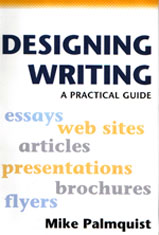
Palmquist, Mike. Designing Writing: A Practical Guide. Bedford/St. Martin. Boston. 2005.
Rogers, Susan. LS462 Senior Project II www.csupomona.edu/~srogers/eng105/index.htm .
The
links to outside sources appearing in this review are in the "Resources
for Document Design" section of Designing Writing (pages 123-124).