A visual and textual analysis of websites associated with plagiarism and plagiarism detection, particularly from a historical perspective, allows for an analysis of the refinement of metaphorical approaches to plagiarism and research articulated by these sites. Two spaces that particularly lend themselves to such an analysis are SchoolSucks.com and Turnitin.com. Using a web resource like the Wayback Machine, which archives several billion web pages from 1996 and beyond, students can look historically at the different iterations of these sites and how their marketing tactics have changed throughout the years. Along with examining the design of the sites over the years (for example, considering the use of color, visuals, navigational structures, alignment, and so forth) and the textual content, students can be prompted to address how metaphorical language and imagery has been refined to support particular ideologies related to education, authorship, and academic integrity. Lanette Cadle (2010) addresses the relationship between metaphorical language and studies of plagiarism and technophobia, noting that "metaphor is not mere ornamentation, it is the pivotal mental construct that builds meaning for abstract concepts. When analyzed, it is also a window into ... motivations or intent" (n.p.). Thus, examining plagiarism detection sites and online paper mills historically, visually, and rhetorically offers us a way to examine possible motivations of their creators. We can therefore see trends across time in the ways that the creators and maintainers of these sites have shaped the design, structure, and content of the sites to meet the evolving needs of their audiences.
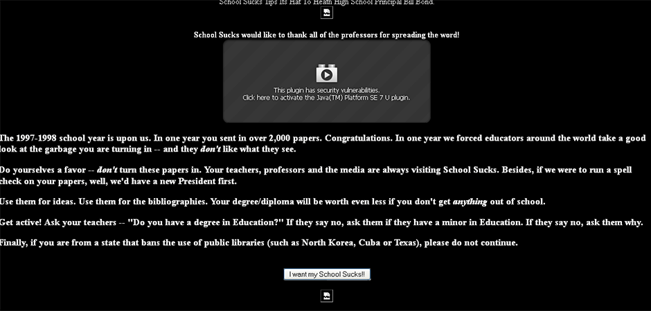
SchoolSucks.com has changed a great deal over the years; its design, content, and tone has been altered to refine its ethos for individuals seeking the materials held in its site. Early on, SchoolSucks was unprofessional in its appearance, with a simplistic layout, crudely rendered graphics, and a limited design. The image below shows SchoolSucks' splash page in 1998; the design is incredibly simplistic, with just a black background and white text; unlike later iterations of the site, such as in 2013, which have a more sophisticated design schema, the early versions of SchoolSucks showcases an almost DIY (do it yourself) style. Reinforcing this DIY feel is the direct address of the intended audience by the author of the site, Kenny Sahr, using personal pronouns such as us, you, and we (and furthermore pitting the intended audience together with the authors of SchoolSucks against instructors through addressing instructors as "they"). There is a curious tension between the intended use of the site and the messages the site seems to espouse, particularly on its front page. As a space where students can upload their papers and, as the site has described it, "download your workload," SchoolSucks has always aimed to make money through the creation of a massive database of papers (much like Turnitin.com). Yet the front page of this early iteration of SchoolSucks attempts to employ what almost seems like a critical pedagogy approach; it urges students to get something out of school, to be an active presence, and to critique their instructors' credentials. Note the aggressive tone that encourages students to not use the papers uploaded to the site and instead push their instructors to describe whether or not they hold a degree in education. It notes that "in one year we forced educators to take a good look at the garbage you are turning in," and as Sahr described in early interviews, "School Sucks is the checks and balance of the education system—the papers are the result of the work of teachers. And if the papers are bad, then what does this say about their work? You're looking at mediocre writers taught by mediocre educators. Its [sic] not our best and brightest going into teaching" ("Spank Magazine," 1999, n.p.). It is intriguing to see how a space billed as an online paper mill relies upon messages of critical pedagogy and urges students to speak up about their educational experiences, echoing Ira Shor's (1980) depiction of the educational setting as one in which students' time is wasted, with the result being "lots of anger, destruction of school property, and attacks on teachers ... regimentation [ensures] students know how to sabotage classes at any level of schooling" (p. 9). SchoolSucks' ethos capitalizes on that feeling of anger, that desire to attack what seems to be a worthless enterprise.
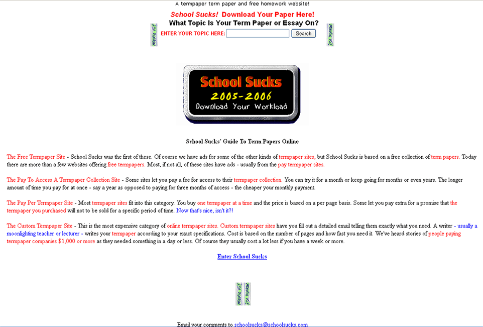
Even in later years, SchoolSucks retained a low-budget DIY look to its site. The image below presents the main splash screen for SchoolSucks in 2006, with a white background, a few small graphics, and a brief section of text. The site relied on many of the hallmarks of a beginner’s web project: flashing animated graphics, an overabundance of color rather than a carefully considered design scheme with coherence across the entire site, and inadequate navigation guides. Spelling and grammar errors abound, such as the first sentence on the page: "A termpaper term paper and free homework website!" The site's "media kit" attempts to explain how the intended audience drives the design choices: "The School Sucks Brand: A brand that teens and students identify with in a manner like no other. One of the few brands talking to young people at eye-level. A brand that has helped define 'cool' on the Internet for over 6 years. A brand that is a household name." Yet these designerly and writerly choices, upon further examination, make sense given the ethos that SchoolSucks has tried to create for itself since its inception, an ethos that unmistakably pits students against instructors and even against the business of schooling itself. The design and content seem to say, "Why bother? School is difficult but you don't reap any rewards for working hard. Let us help you do as little as possible to get by." These early examples illustrate a site design that also appears to do as little as possible in an attempt to get by.
The contemporary design of SchoolSucks has become more sophisticated, but the underlying message of critical inquiry into the classroom and educational practices remains. Many of the choices in design and content remain driven by this emphasis on critical inquiry pitting students against teachers and higher education. The screenshot below depicts the current front page of SchoolSucks.com; compared to the earlier 1998 and 2006 versions, the design has evolved substantially. The use of color is much more consistent across all pages; the site now uses Cascading Style Sheets (CSS) for an improved look and feel. Social media links offer users the ability to like the site on Facebook and to recommend the site on Google+, and users can now purchase branded merchandise from CafePress with the site's logo and catchphrase "download your workload" emblazoned on it. The student with his sunglasses on (presumably in class) slouches in his desk and smirks, while an "A" symbol nearby evokes both the grade and the anarchy symbol (also called the "Circle A").

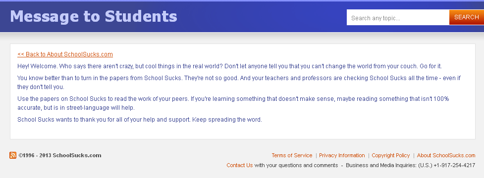
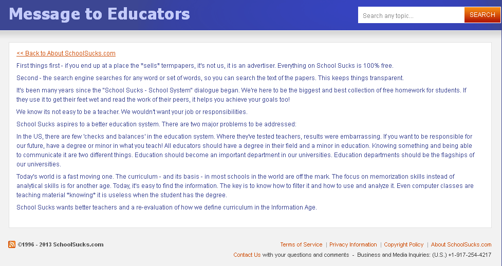
The design may have become more sophisticated but the underlying message still retains an emphasis on critical classroom inquiry. The aggressive tone shown in the earliest incarnations of SchoolSucks, however, has been toned down substantially in the messages to students, but has ramped up in messages to teachers. For example, in the "message to students" section, the site continues to urge students to create change: "Don't let anyone tell you that you can't change the world from your couch. Go for it." The site no longer presses students to ask their teachers about the credentials; however, the message to instructors is far more pointed in its critique of the United States educational system. The two screenshots below juxtapose the message from SchoolSucks to students and educators, illustrating how the site's concerns about education have resulted in a far sharper, more aggressive message to instructors who find themselves at the site: "Where they've tested teachers, results were embarrassing. If you want to be responsible for our future, have a degree or minor in what you teach! All educators should have a degree in their field and a minor in education. Knowing something and being able to communicate it are two different things." The early sense of classroom sabotage suggested by the late-90s SchoolSucks site has reached a higher level of sophistication in early 2013, a level that borders on educational anarchism (which is again reinforced by the imagery and the textual content of the site). The message of direct action that subverts educational systems is one that is based in both critical pedagogy and anarchism, and SchoolSucks' insistence on remaining a free site (as opposed to Turnitin's billion-dollar industry) also reflects an anarchist ideological stance: "According to anarchists, rigid state structures need to be dismantled; people need to reconceptualize how they define community, and also challenge the ideologies that emerge from a profit-based and commercialized society" (DeLeon, 2008, p. 123-124).
These examples from SchoolSucks.com illustrate how an online paper mill site could be incorporated into the composition classroom as an artifact for analysis at multiple levels. Students could begin with a rhetorically focused analysis of the designerly choices made throughout the site, paying attention to the use of color, visuals, music, navigational structures, incorporation of social media elements, the URLs used, advertisements embedded in the site, and so on. These design choices dovetail nicely with the content and textual choices made throughout the site as well. What is said and who is saying it? What can be discovered about the author or authors of the site, particularly with regard to their credibility and background? How does the textual material presented construct particular ideological representations of the world through metaphorical language and figures? What kinds of communicative actions are valued and prompted by the site? How do the metaphors used in the site construct an identity that represents the sites’ creators as well as various other groups (in this case, educators, parents, administrators, students, plagiarists)? And in what ways, if any, does the site urge direct action or challenge the status quo?
home ![]() history, page 1
history, page 1 ![]() history, page 2
history, page 2 ![]() other people's papers, page 1
other people's papers, page 1 ![]() other people's papers, page 2
other people's papers, page 2 ![]() other people's papers, page 3
other people's papers, page 3 ![]() resistance
resistance ![]() references
references