Monochromatic Elegy
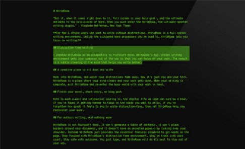
Given the similar appearance of most distraction-free writing environments, it would be easy to assume that they are all pretty much alike. There are, however, subtle and important differences. Where these applications tend to distinguish themselves from one another is underneath the interface, in preferences and commands hidden in self-effacing menus or keyboard shortcuts. Some allow only plain-text formatting,while others also permit rich-text formatting. Some enable the use of Markdown syntax for on-the-fly formatting, while others keep formatting options to a bare minimum. Many allow users to customize fonts and screen color, while some limit these choices to one or a few. Despite these differences in features, though, the basic idea is the same: they present the user with little more than a blank screen and a cursor. Even within that kind of limited interface–a blank screen and a cursor–we might expect to see more variety of color, fonts, etc. than there actually was when distraction-free writing software began to emerge in the middle of the last decade. What is interesting, then, is that the default appearance across many early entrants into this market were remarkably similar. The following image is of Hog Bay Software’s WriteRoom, which was among the first, and also typical of most applications in this category.

Until a recent update, the default settings of WriteRoom were as they appear here: green mono-spaced type on a black background, reminiscent of the monochrome monitors that were standard fare in the early years of personal computing. WriteRoom was not unique in employing this particular aesthetic: many other applications, like the aforementioned FocusWriter, WriteMonkey, and Q10, which were among the most popular in Lifehacker.com’s reader poll, employed similar default appearances.
The appeal of this aesthetic seems to be rooted in a sense of nostalgia. The resemblance of the green-on-black default appearance to long-obsolete monochrome monitors does not go unnoticed by reviewers of this software. Rob Pegoraro (2008), a technology columnist for the Washington Post, for instance, begins his review of WriteRoom like this:
Green text on a blank, black screen, with a square, blinking cursor. This was how most of us wrote on a computer in the early 1980s, and it’s resurfacing a quarter of a century later.
But more than sentimental affection for the 1980s is implied in some comments on this aspect of distraction-free writing environments. Jason Fitzpatrick (2009), a blogger at Lifehacker.com, notes the resemblance to “green-on-black minimalism of early word processors.” Craig Grannel (2012) at MacFormat.com writes that
instead of myriad palettes and formatting options, you got a basic text document and a full-screen mode that brought to mind halcyon days of working with basic word processors
The apparent value, then, of this particular aesthetic lies not only in its association with a particular decade, but also in its “minimalist” rejection of the proliferation of features added to mainstream word processors in the intervening decades. What software developers (ostensibly) intended as improvements in functionality have instead come to be perceived by some as unnecessary distractions, as Joel Falconer (2009), another productivity blogger, puts it:
eliminating distractions is a lot more difficult than it once was in simpler times, that’s for sure, and the typical productivity suite of word processors and email clients aren’t making it any easier as the years roll by and the feature bloat in such simple tools increases.
So, what is often viewed in the mainstream as technological progress is framed here as an impediment to productivity. That is, the development of new features in such programs as Microsoft Word become, from this perspective, just the accumulation of “distractions” that get in the way of writing.
There is, moreover, a sense of loss being communicated here, as if those “simpler times” and “halcyon days” of early word processing have been subsequently replaced by more complicated and somehow less joyful experiences of writing on screens. While these sentiments are admittedly hyperbolic, they nevertheless reveal an affective dimension of writing that is often overlooked in more cognitivist approaches to writing process. As we argue in another section of this webtext, word processing software is a tool that mediates the activity of writing, and as such it can shape the preferred practices of users in supportive and disruptive ways. Whether or not the “basic word processors” of the 1980s were actually better in some demonstrable way is not the point here. In fact, one interesting aspect of this nostalgia is how contingent it is upon a revision of the history of word processing. What these reviewers of today’s green-on-black emulations of early word processors frame as “simplicity” were once viewed instead as serious technological limitations of the software. Some researchers in the 1980s, for instance, noted the difficulties writers faced with the small size of computers screens and the subsequent inability to view more than a few lines of text at a time (Hawisher, 1986; Haas & Hayes, 1986). In contrast to writing with paper, these small screens were framed as a debilitating limitation. Now, when compared to full-featured word processors that can display several pages at once, software that constrains writers’ view to one sentence at a time (a feature of the popular iA Writer program) is now viewed as a productive constraint. As James Wertsch (1998) has explained, “It is usually only with the appearance of new, further empowering (and constraining) forms of mediation that we recognize the limitations of earlier ones” (p. 40). As these distraction-free tools illustrate, recognizing the limitations of earlier forms of mediation need not result in the rejection of such tools as flawed. By borrowing the form of early word processors, distraction-free writing tools resonate with a dissatisfaction, felt by some writers, with how mainstream word processors have evolved over the years. The green-on-black aesthetic and limited view, then, is not just a gimmick, since it signals to potential users a promise to reconfigure writing activity so that there is less distraction.