Statistical Reasoning
This section will consider word layout and color assignment for word cloud visualizations. While these two aspects of a word cloud appear to be designed mostly based on appealing visual stylistics, this section will explain how these components may also fit within an inventive framework for information rhetorics and statistical reasoning. As the introduction argues, it is tempting to understand data visualization and information rhetorics based on traditional differences between rhetoric and statistics—where statistics provides the “content” analysis and quantitative “substance,” and where rhetoric is merely employed near the end of the process to make the visuals appealing, artistic, or persuasive. In order to move past the simplistic fact/deception binary of information rhetorics, we need more complex investigations that show data visualization to be both rhetorical and statistical throughout the process. From the choice of which data to collect or access, to the technologies and methodologies selected for processing and scrubbing the data, and finally, to the analyses and visualizations used to investigate or summarize the data—when choice is involved at any point in the process, rhetorical frameworks are an integral part of making data meaningful.
Word Layout
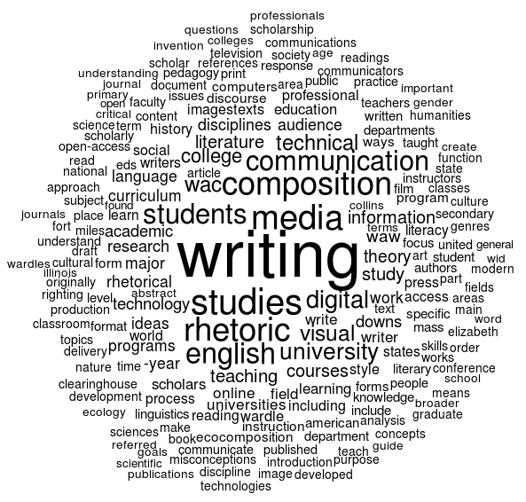
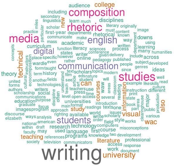
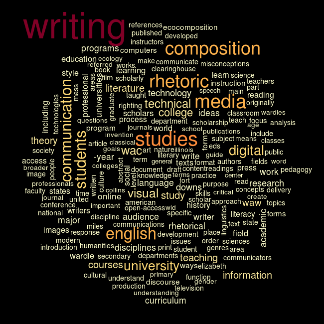
In the Data Janitor section, the words in the word clouds were laid out according to their frequencies. The words with the highest frequency were placed in the center, and then the words were arranged in circular fashion outward from center as their frequency reduces. While this layout makes sense, it arguably makes it more difficult to see details and contrast among ranges of word frequency. While it may be counterintuitive, a random word layout provides an alternative perspective that improves upon these issues. The two images below show the difference between a frequency-based layout and a random word layout. The first image in Figure 5 displays the center-out layout, and the second image in Figure 6 displays the words at random with 10% of the words turned 90 degrees.
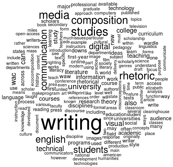
By changing the logic of how the words are laid out in the word cloud, it is arguably easier to visually analyze and compare word frequencies. The layout is randomized, but the size of the word font remains categorized according to frequency. This allows the visualization to display more contrast among the words without making the visual altogether useless. Also, by turning a portion of the words 90 degrees, this creates further contrast and variation in the visual.
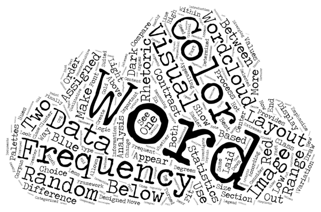
Finally, it is important to note that even when word cloud layouts are more artistic or focused on visual stylistics, statistical properties remain. Even though the shape of the word cloud in Figure 7 was designed to look like a puffy cartoon cloud, font size remains categorized according to word frequency and data scrubbing was still needed to emphasize the semantically relevant words in the text.1
Color Assignment
The colors for the images below are assigned to words systematically using the RColorBrewer package in R. This package is based on the work of Cynthia Brewer—a geography professor at Penn State University whose work focuses on cartographic design. While mapping and cartography may not seem relevant to word cloud visuals, the visual problems involving color assignments in mapping and topographic representation are relevant to many types of complex visualizations where “understanding how to manipulate the three perceptual dimensions of colour (hue, saturation and lightness) is required to create attractive and logical colour sequences” (27).
ColorBrewer has 35 color scheme “sets” divided into three groups: qualitative, sequential, and diverging. In their publication that explains the rationale and development of the ColorBrewer tool, Cynthia Brewer and Mark Harrower describe the three groups of color schemes as follows:
Qualitative
Qualitative colour schemes rely primarily on differences in hue to create a colour scheme that does not imply order, merely difference in kind. Since there is no conceptual ranking in nominal data it is inappropriate to imply order when depicting these data with colour (for example, by using a light-to-dark single-hue sequence). Qualitative schemes work best when hue is varied and saturation and lightness are kept or nearly constant. We do not recommend arbitrarily using strong ‘neon’ colours (i.e. high saturation) and pastel colours (i.e. light and low saturation) in the same qualitative colour scheme because these variations in saturation might imply order.
Sequential
Sequential colour schemes imply order and are suited to representing data that ranges from low-to-high values either on an ordinal scale (e.g. cold, warm, hot) or on a numerical scale (e.g. age classes of 0–9, 10–19, 20–29, etc.). Lightness steps dominate the look of these schemes, usually with light colours for low data values and dark colours for high values. ‘Dark equals more’ is a standard cartographic convention. Sequential schemes can be either single hue (e.g. same blue, with different lightness and saturation levels) or multi-hued (e.g. light yellow through dark green). ColorBrewer includes 12 multi-hued sequential schemes and 6 single-hued schemes.
Diverging
Diverging colour schemes should be used when a critical data class or break point needs to be emphasized. The break or class in the middle of the sequence is emphasized by a hue and lightness change and should represent a critical value in the data such as the mean, median or zero. For example, a choropleth map of poverty rates might be designed to emphasize the national rate (midway through the range of rates shown on the map) so that places above and below the national rate are shown with different hues and thus have similar visual emphasis. Diverging schemes are always multi-hue sequences and, because of the way in which lightness is varied, do not make good black and white photocopies or prints (which only capture differences in lightness).
The diverging color scheme is easily determined as not relevant to word clouds since it focuses on the “break” or “middle” range of the data, and word clouds are meant to emphasize the most frequent words. Therefore the remaining word clouds below consider and compare the qualitative and sequential color schemes.
The next two images show two variations of the qualitative color scheme.
While the colors help improve the appearance of the word clouds, it is not apparent what the colors designate or how they add to or improve the meaning of the visuals. Because the colors in qualitative schemes are meant to show nominal or categorical data, the colors in these two visuals are arguably assigned according to a statistical rationale that does not fit the usual intention of a word cloud (to emphasize the most frequent words in a text or corpus). If Figures 8 and 9 were displaying categorical tags for an archive, or differences among types or qualities, then the qualitative color scheme would seem more appropriate. But since the underlying dataset is a corpus of text articles, and the core quantitative component is a range of word frequencies, the sequential color scheme is arguably the most relevant of the three.2
The next two images show two variations of the sequential color scheme.
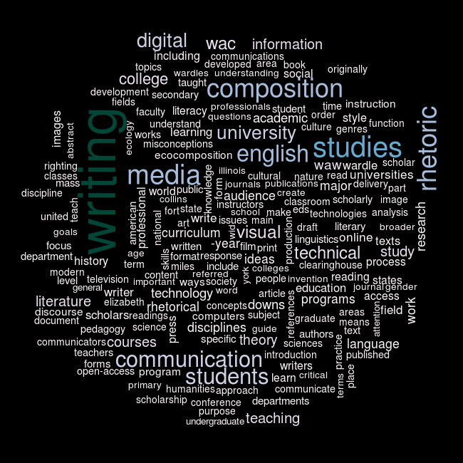
The sequential color scheme utilizes a range of lightness and saturation levels for the colors, and so a black background is necessary to keep the lightest colors from disappearing into a white background. Figure 10 uses a yellow-orange-red sequential color scheme—where yellow is assigned to the lowest frequency words, orange in the middle ranges, and red for the highest frequency words. Figure 11 follows the same logic, but with a purple-blue-green color scheme applied to the words. While it would be excessive for a word cloud, a legend could be added to explain which colors and hues represent which frequency ranges. However, the point of many data visualizations is to enable readers to quickly observe and understand the visual meaning extracted from the data. Certainly, there are many complex visualizations where legends or additional annotations are required, but for a less complex visualization like a word cloud, color assignment should effectively improve the meaning without additional annotation.
The puffy cloud visual was created with Tagul using the words from a draft of this section as the text data.↩
The qualitative scheme is also shown here because it’s the common color method for many of the word cloud tools available on the web—where color palate choices are often not made based on statistical reasoning, but based purely on visual design. There is nothing wrong with this for many general uses of word clouds. However, when word clouds are used for analyzing textual corpora, color assignment rationales ought to be considered more explicitly along with other methodological considerations.↩
© 2015 Aaron Beveridge