Student Example #2: Collage
Visual Argument Assigment
Click above to view the assignment sheet.
Assessment with Writing Program Rubric as presented in comments to student
Thesis/Focus
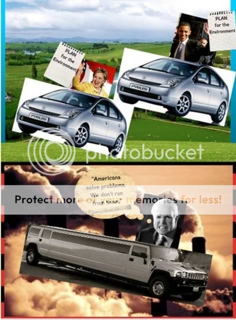
You are clearly making an argument about the environmental plans of the 2008 presidential candidates. Furthermore, each mode (image and text) helps to contribute to that overall thesis. Yet, a greater awareness of audience could be demonstrated through a stronger demonstration of the thesis. While the audience is meant to draw conclusions about McCain's seeming lack of an environmental plan or dismissal of environmental problems, the quotation you chose for McCain does not draw a strong enough comparison between the candidates.
Organization
The organization of this project is clear. The split image reinforces the comparison you are making between the environmental plans of democrats and republicans.
Development
You rely on supplementary and juxtapositional development. You use both images and text, but in a supplementary manner where the image is dominant. You also use juxtaposition by placing two opposing images together. You make meaning through the clash of images and text in the top and bottom halves. However, you argument is not overly developed or complex. This is a complicated issue, but you present the issue in a falsely simplified manner.
Syntax and Diction
While you project uses little text, it could use text more effectively. The quote chosen for John McCain does not seem strong enough. A quote that refers directly to his environmental plans would be more appropriate considering the text used in the top half of the collage.
Format and Design
You demonstrate an awareness of format and design through the choice of background images, color, layout, and typeface. The backgrounds help to establish the comparison being made between the plans of the democrats and republicans. Similarly, the colors (blues and greens on the top and reds and blacks on the bottom) help to convey the thesis. The layout, by splitting the screen into two distinct, yet similar, sections again emphasizes the comparison being drawn in the visual as a whole. Finally, the typeface is, for the most part, clear and easy to read. In an early draft of this project, elaborate and difficult to read typefaces where used. While McCain's web address is still small and hard to read, the alteration to the typefaces demonstrates that you were continuing to think about the rhetorical importance of format and design.
Research
You linked to researched sources, specifically the candidates' web sites. Furthermore, you turned in a works cited page, which includes citations for the web sites linked to and the images used.
Mechanics
There are no mechanical errors here. Images and text appear on the screen as you intended. Furthermore, you effectively used links. Each "plan for the environment" is linked to the particular candidates plan, and McCain's quote is linked to his webpage.
