maps
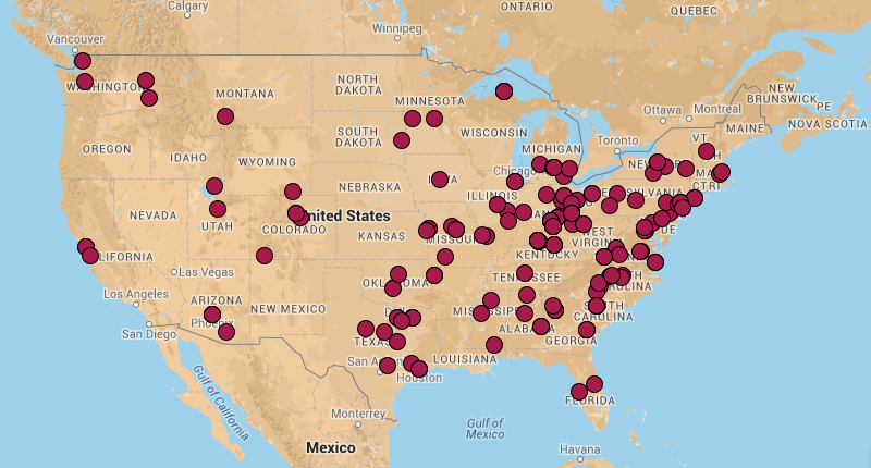
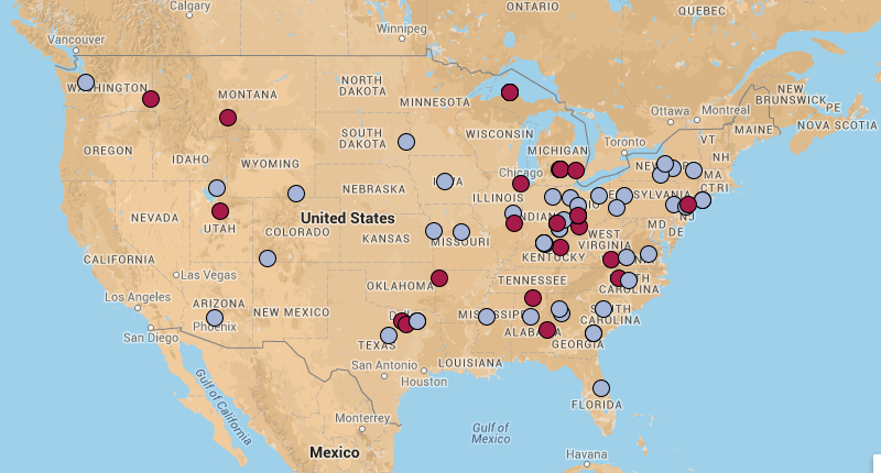
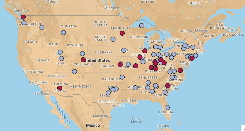
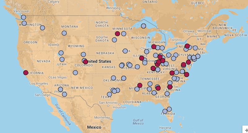
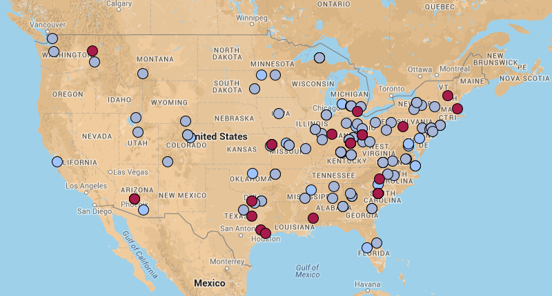
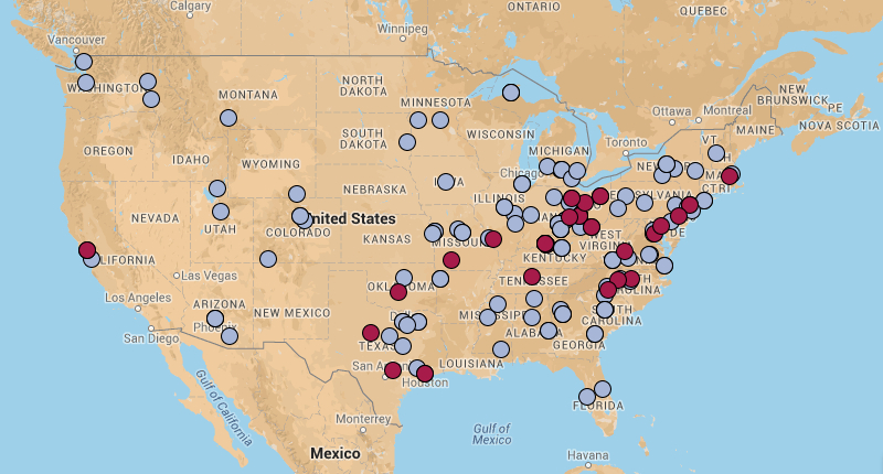
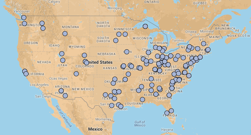
The following images show cumulative DMAC attendance by year and location of home institution. Red circles show home institutions corresponding to the current year and blue circles show home institutions corresponding to a previous year. The University of Alaska-Anchorage and the American University in Cairo have been excluded for map usability. You also can view a series of interactive Google maps for each year's DMAC attendance, or go back to the videos page.
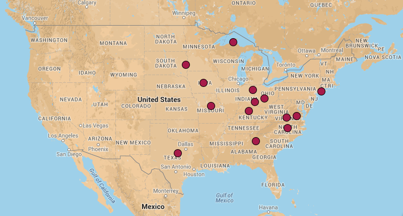
2007 DMAC Attendance
2008 DMAC Attendance
2009 DMAC Attendance
2010 DMAC Attendance
2011 DMAC Attendance
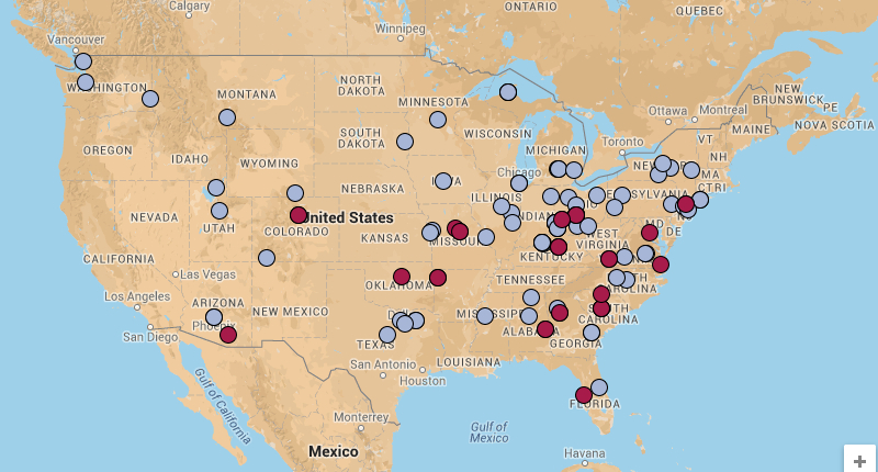
2012 DMAC Attendance
2013 DMAC Attendance
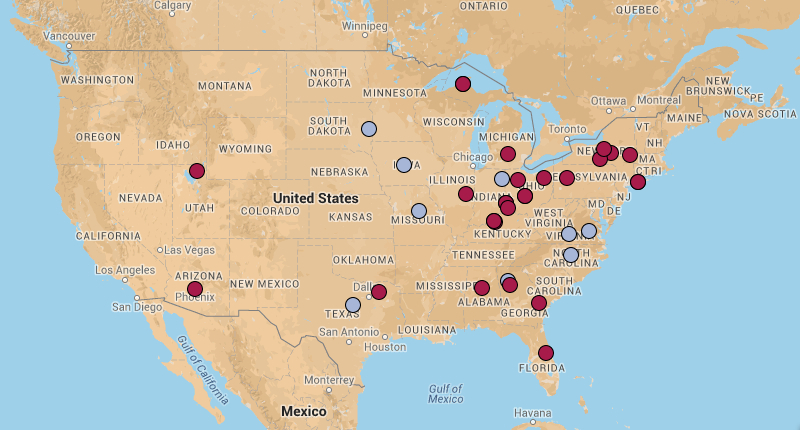
2014 DMAC Attendance
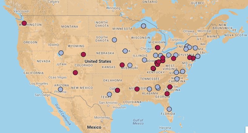
2006-2014 DMAC Attendance
2006-2014 DMAC Attendance